Introduction
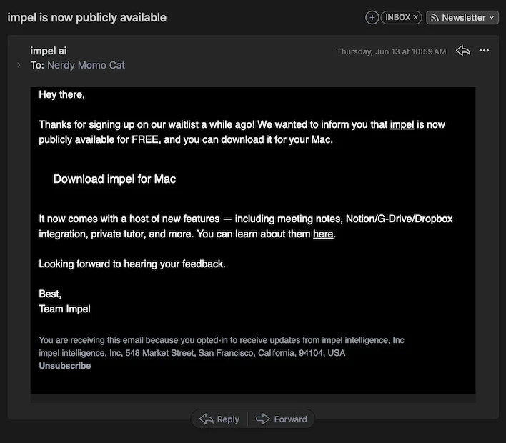
So, a week back I received an email saying that I now have access to impel ai.
Website look comparison
Thankfully, the main concept of the website has remained consistent throughout the year, which is more than can be said for many AI apps out there right now.
Thankfully, the main concept of the website has remained consistent throughout the year, which is more than can be said for many AI apps out there right now.
Setup
The first thing I did was open up impel.ai but it is a completely different website. The actual website is tryimpel.com.
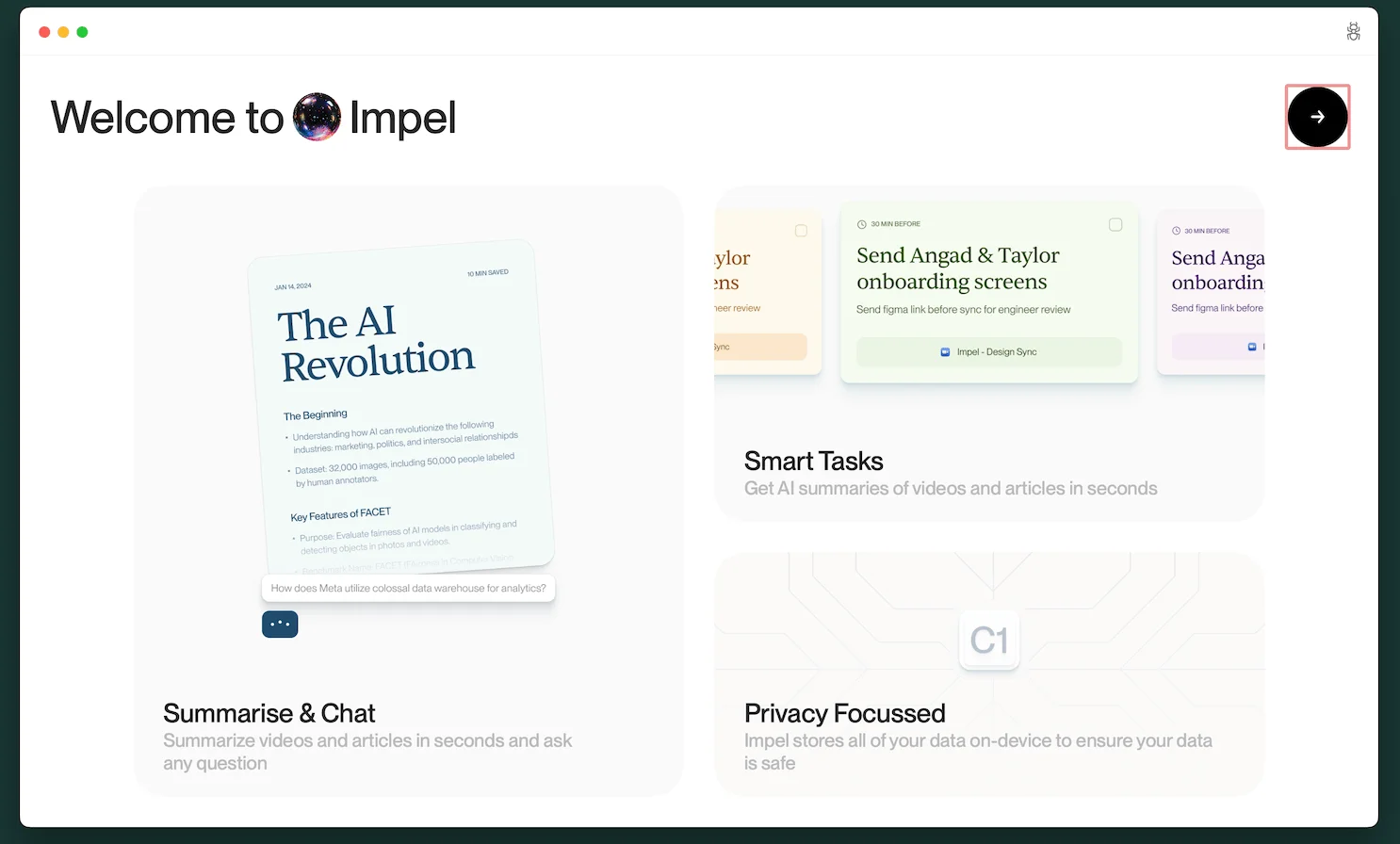
This is the screen that opens up, so at this point, I expect a summarize and chat feature, smart tasks, and a privacy-focused experience.
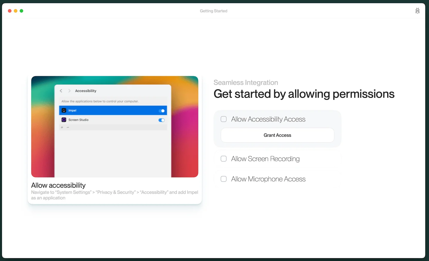
The second step is to provide every single access known to man, with no way to move forward without it. I understand they need microphone access to summarize meetings, but there are other features they claim to have that should be accessible without these elevated permissions.
Onboarding
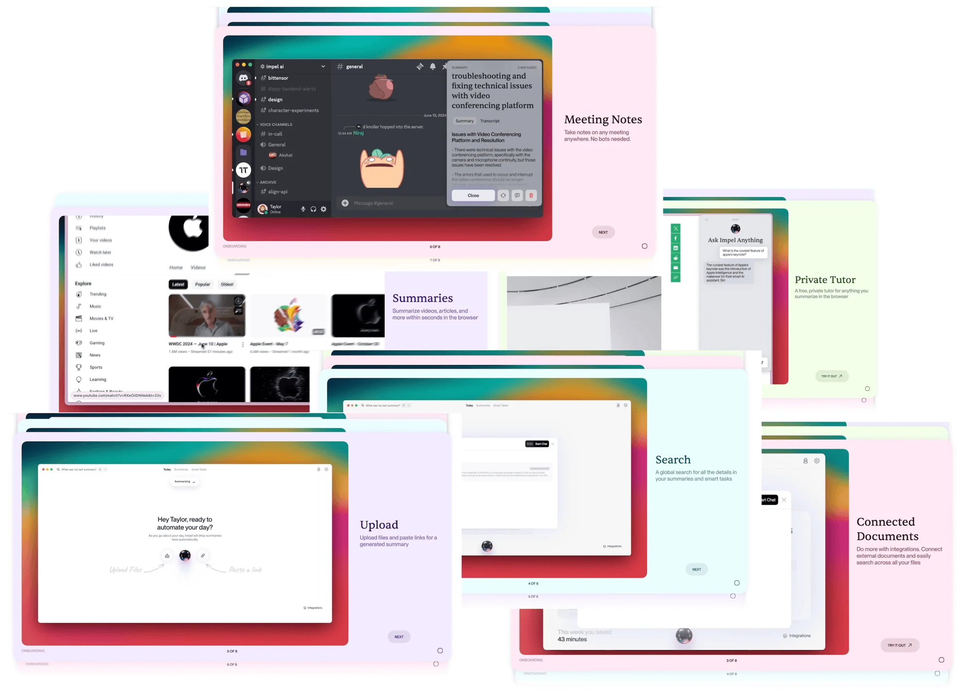
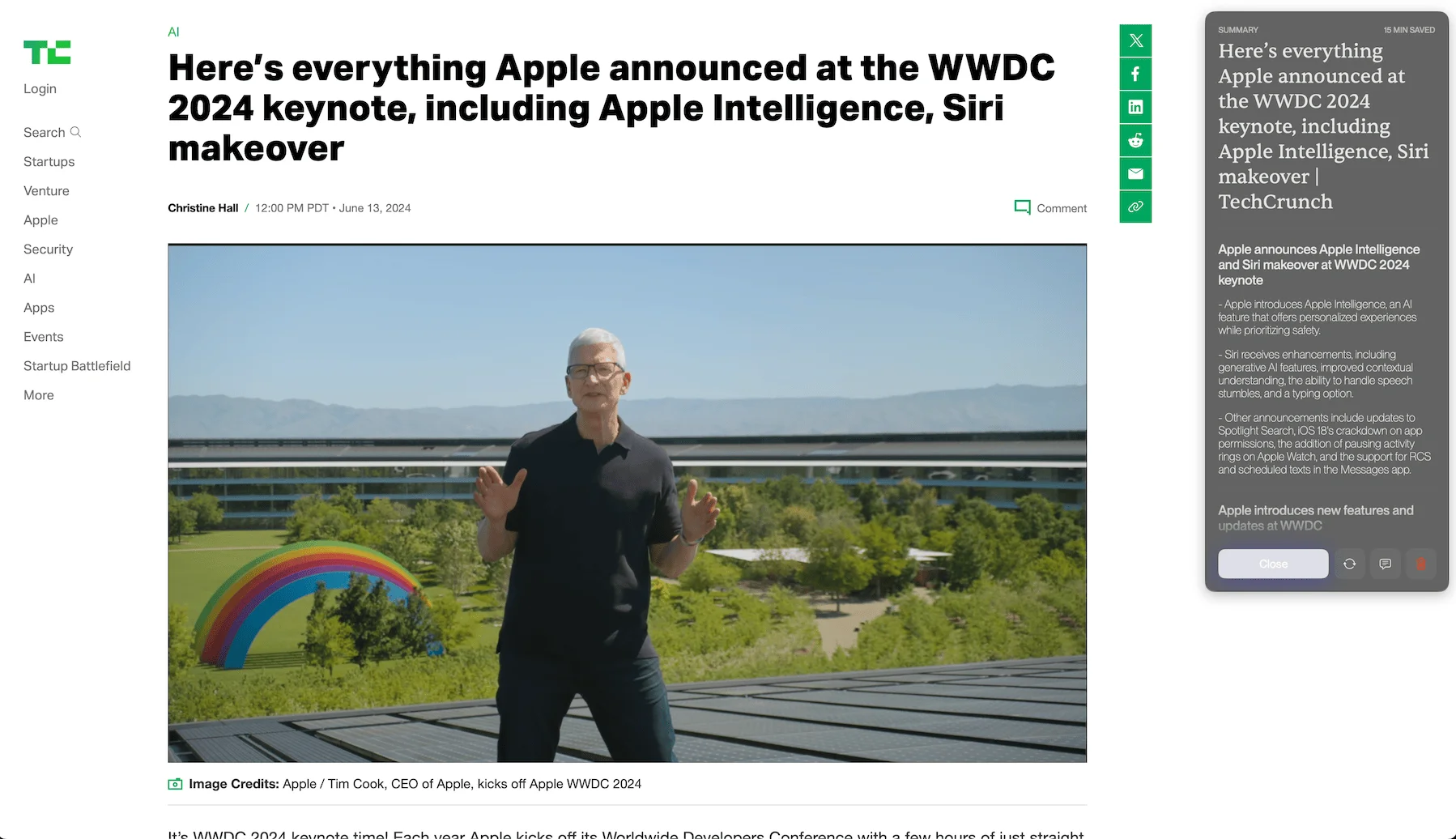
The first option takes you to the WWDC 2024 keynote on TechCrunch and provides a summary of the article on the right, always pinned to the top. Additionally, a summary is provided on the right, pinned near the top right close to the menu bar. You need to click the "Create Summary" button, but it's not clear when or if you need to click it.
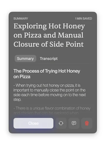
Just a heads-up: the pop-up on the side doesn't close automatically. So, whenever you try something new in the on-body, you'll need to manually close the pop-up to see the next one appear on the window.
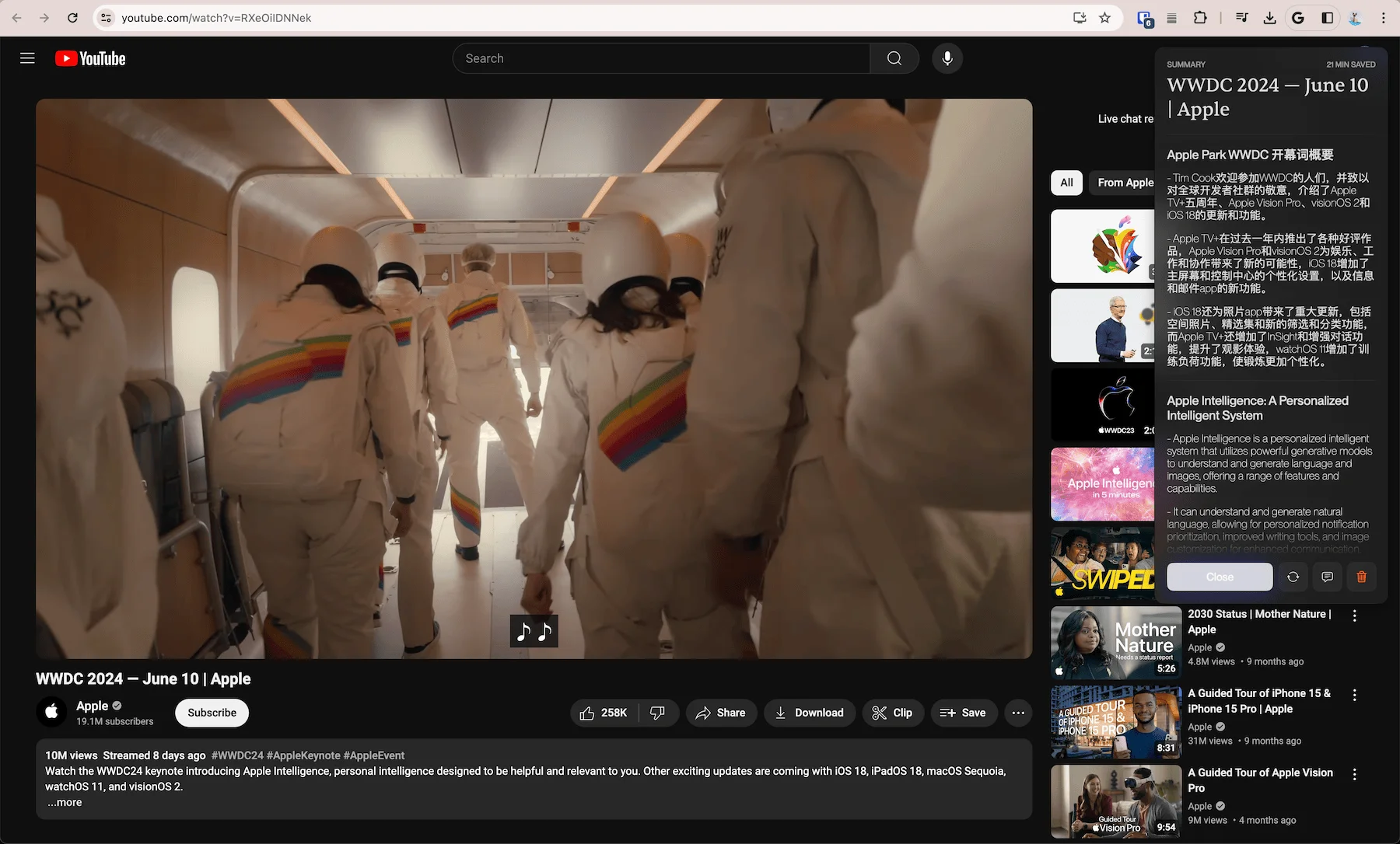
The second onboarding screen directs you to a YouTube video where you need to click the summarize button. First, remember to click the close button, then proceed to the summarize button. If you check the screenshot, you might notice something odd—it starts off in Chinese. I'm not sure why that happens.
So, here's a weird thing that happened during the onboarding process. While I was navigating away from the video, I had Twitch running in the background. I was dictating my thoughts about the app for this post, and somehow, the app started using the Twitch audio along with what I was saying. It either picked up the audio through the app itself or through my headset's microphone—I’m not sure which. The result was a strange, jumbled summary of the Twitch conversation and my own words. It was pretty weird and intrusive because, although I had given microphone access, this was not what I expected. It felt very omnipresent and not something I was looking for.
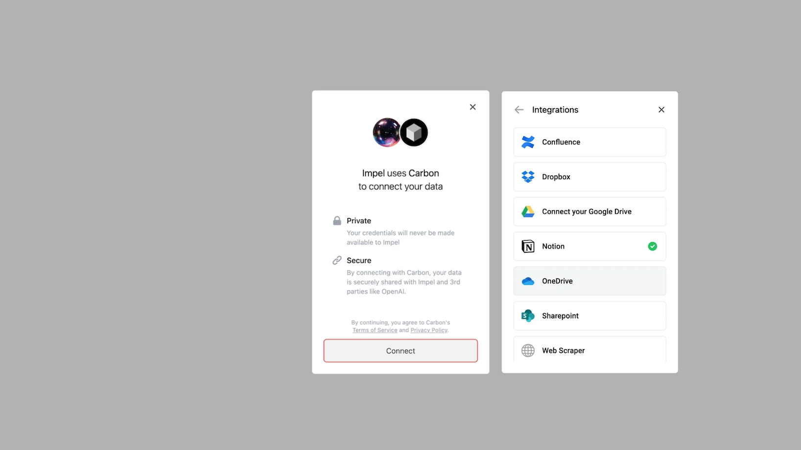
Okay, so the next onboarding screen took me to this integration spot where it says the app uses carbon to connect your data. The options it provides include Dropbox, Google Drive, Notion, and a web scraper. I used the Notion connection, but as you'll see later in the post, it didn't seem to impact my searches. I couldn't find anything from Notion or referenced in the answers provided. It might not be implemented, live, or discoverable—none of which are great at the moment.
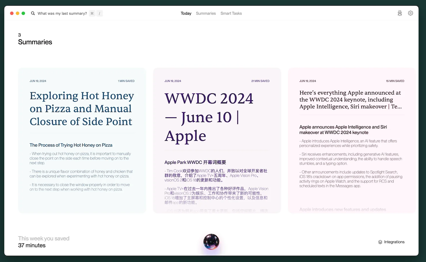
After completing the onboarding, you'll arrive at a summary screen displaying all the summaries the app has created and the estimated time it has saved you. I'm not sure how this is calculated—probably based on the number of words and reading speed, which I find a bit misleading since people don't usually read that way, and that's what the AI is doing. But aside from that, the screen looks fine. However, you'll notice it already includes Chinese characters and some odd summaries, like a mix-up of what I was saying on the microphone—things I didn't ask for or expect at all.
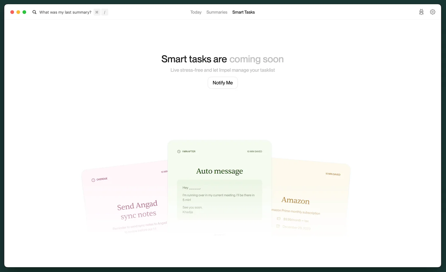
The main distinguishing feature they've been promoting is that you don't have to do anything with the prompt. When the model sees your laptop, it understands what should be added to your backlog based on what's on the screen. However, it's still not available. They claimed it was trained at least 12 months ago, which is absolutely disappointing.
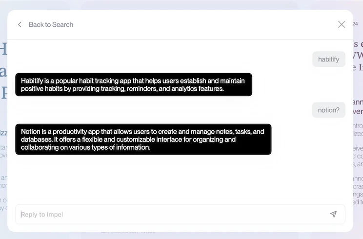
I then checked if the Notion Connection impacted search or conversation, but it didn't seem to. I posted a recent article I wrote about defining and using AI to add locks, but it didn't reference anything from the Notion Connection.
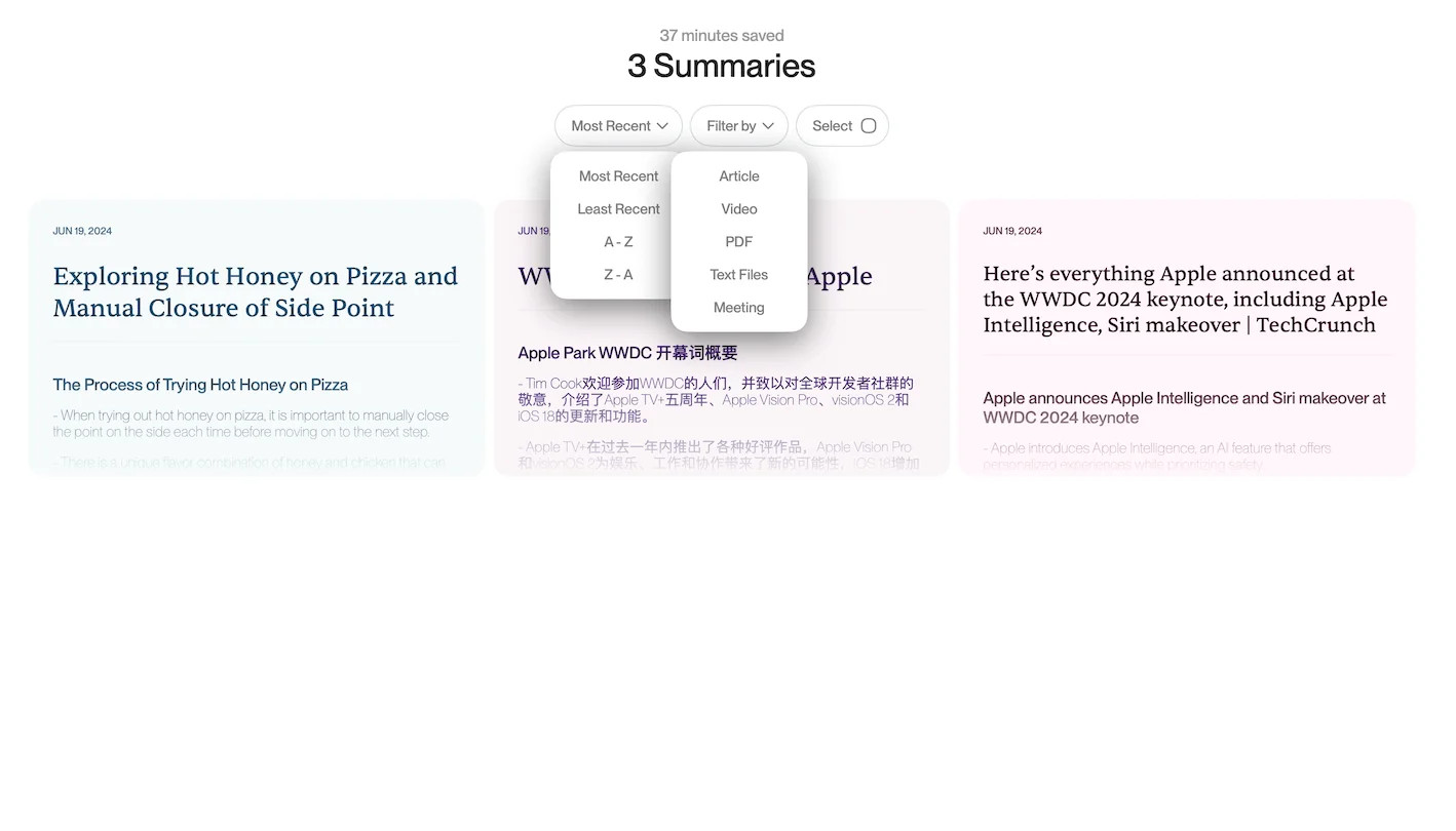
The Summaries view has a quirky bug with the select drop-downs, allowing multiple to open at once and overlap. It's not a major issue, but worth mentioning in terms of design. Overall, the app looks really cool and is great for demos. It includes basic filtering mechanisms to identify whether the summary was generated from an article, video, or other sources. However, it lacks the auto-tagging features you'd expect from an LLM application. It does have sorting, making it similar to a gallery view of database points you'd expect from any modern application.
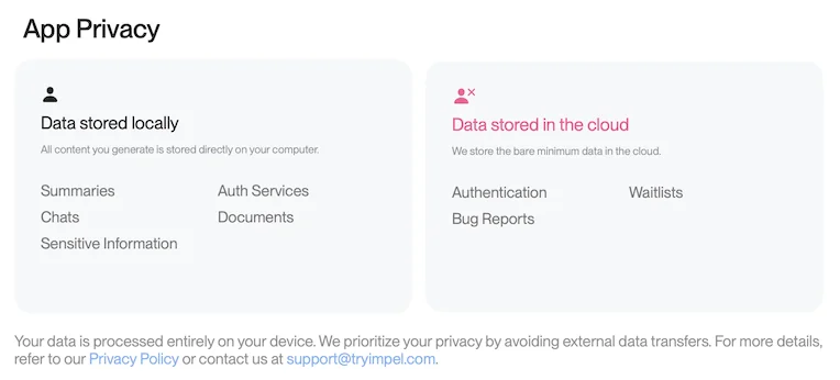
It says they prioritize privacy by avoiding external data transfers, which makes it unclear whether they're sending data to OpenAI or not. I've linked the privacy policy here: Privacy Policy
The app claims to store all data locally, including summaries, chats, sensitive information, and documents. However, I'm unsure where they're getting the summaries from. It doesn't seem to be a local model because it hasn't changed any data storage availability on my device, suggesting it might be cloud-based. The privacy policy indicates that all generated content is stored on a computer which seems to be specific to what happens after generation rather than during generation.
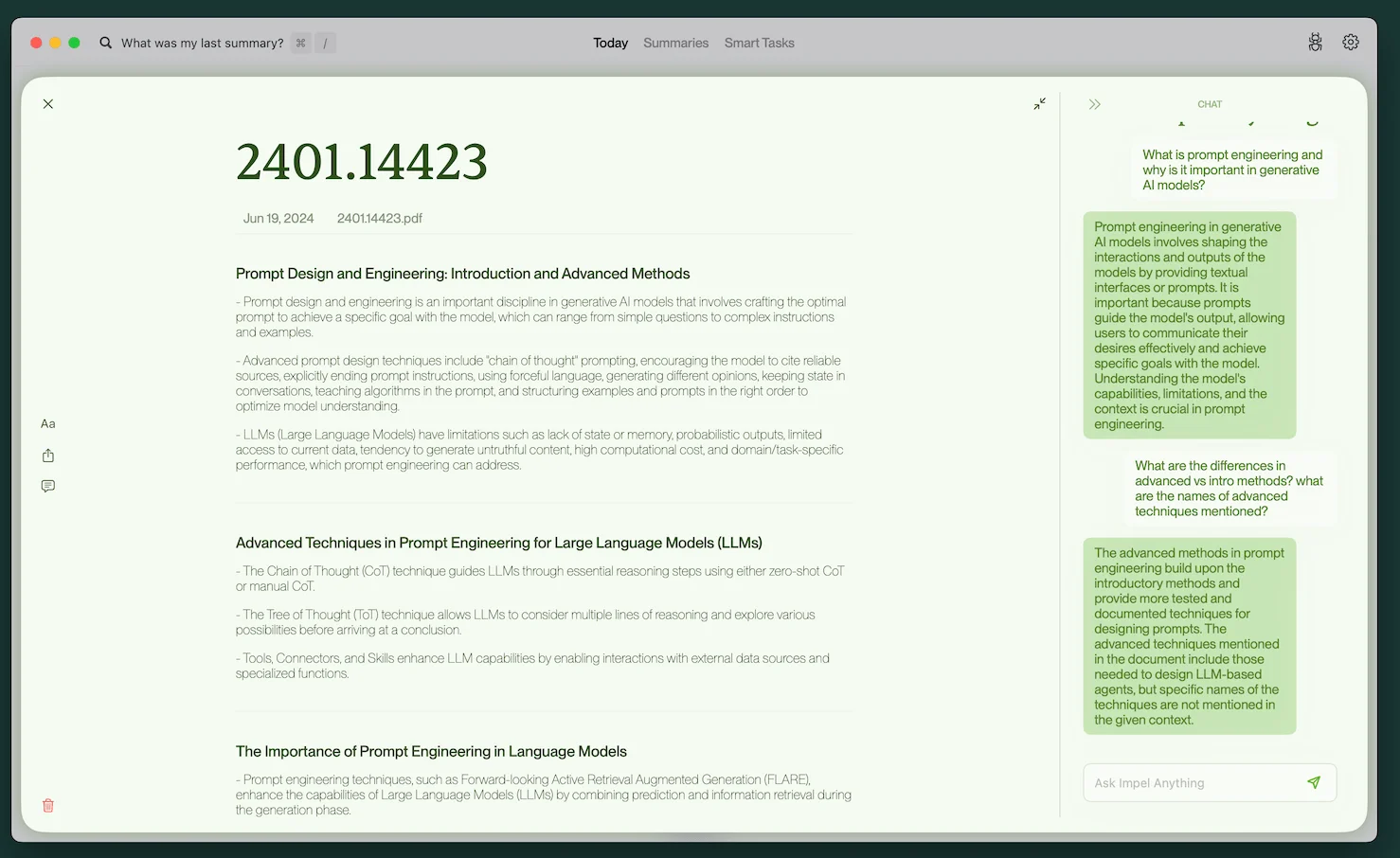
The last thing I tried was uploading a PDF about prompting techniques. I was extremely disappointed. The UI is pretty cool, with a card-like structure that opens up into a center panel, reminiscent of a notion center view. The colors are really nice. But when you go into the chat and ask about the document, it doesn't understand or process much.
I'm not sure what's happening here. Even a basic RAG should have performed much better than their current outputs. I don't know if they're trying to feed everything into the context, but it's baffling how this can be so poor when it should just be a minimal v0 implementation of either a RAG or a large context window.
Conclusion
You can skip this for now; there's nothing much to see. But if you're looking for design inspiration, their designs and UI/UX are impeccable to look at, if not impressive to use.
I do app reviews for fun and would never put them behind a paywall. If this helped you in anyway, please consider buying me a coffee here:

