Webtrotion 2.4.x has landed with support for tab blocks and Heading 4.
I think one of the biggest reasons why I'm still maintaining this whole setup instead of using one of the prevalent Notion-to-website converters out there is: no one else is going to introduce and add components at the rate that I need them, and Notion has been shipping fast lately. I think this gives me a good idea of what is available, what can be done versus what can’t be done.
See, here are the headings in order, depicted by non-Taylor Swift songs.
Manchild
So Easy to Fall in Love
bad idea right?
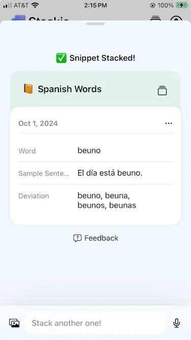
And see, heading 4 is real now
Yes, Notion now supports full tiny-heading mode. Something to note here is that in Webtrotion, we set the page title as H1 and then move down every corresponding heading, so the H1 inside the page becomes H2, H2 becomes H3, and so on. So this H4 on the web page actually renders as H5.
And so are tab blocks
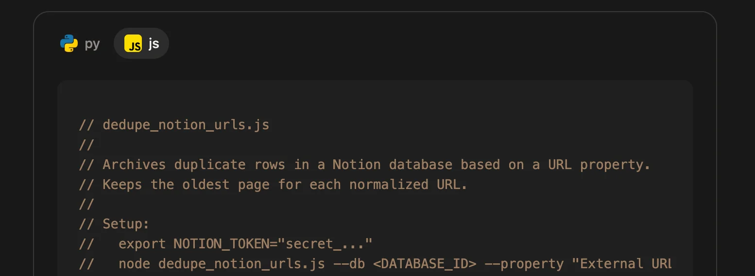
Say, if you have a Notion database where you keep adding the same URL 17 times (same link, different casing, extra tracking params, whatever), this script [a]
And yes I’m showing both versions in tabs [b]
#!/usr/bin/env python3
"""dedupe_notion_urls.py

Archives duplicate rows in a Notion database based on a URL property.

Keeps the oldest page (by created_time) for each normalized URL.

Setup:
  export NOTION_TOKEN="secret_..."
  python dedupe_notion_urls.py --db <DATABASE_ID> --property "External URL" --dry-run

Then remove --dry-run to actually archive duplicates.

Requires:
  pip install requests
"""

from __future__ import annotations

import argparse
import os
import re
import sys
from urllib.parse import urlparse, urlunparse

import requests

NOTION_VERSION = "2022-06-28"


def normalize_url(u: str) -> str:
    u = (u or "").strip()
    if not u:
        return ""

    # make sure it parses (allow people to paste without scheme)
    if not re.match(r"^[a-zA-Z][a-zA-Z0-9+.-]*://", u):
        u = "https://" + u

    p = urlparse(u)

    # normalize host + strip tracking + strip fragments
    scheme = p.scheme.lower() or "https"
    netloc = p.netloc.lower()
    path = re.sub(r"/+$", "", p.path)  # trim trailing slashes

    # drop query entirely (simple, aggressive dedupe)
    # (you can keep whitelisted params if you want)
    query = ""
    fragment = ""

    return urlunparse((scheme, netloc, path, "", query, fragment))


def notion_headers(token: str) -> dict:
    return {
        "Authorization": f"Bearer {token}",
        "Notion-Version": NOTION_VERSION,
        "Content-Type": "application/json",
    }


def query_database(token: str, database_id: str, start_cursor: str | None = None) -> dict:
    url = f"https://api.notion.com/v1/databases/{database_id}/query"
    payload = {"page_size": 100}
    if start_cursor:
        payload["start_cursor"] = start_cursor
    r = requests.post(url, headers=notion_headers(token), json=payload, timeout=60)
    r.raise_for_status()
    return r.json()


def archive_page(token: str, page_id: str) -> None:
    url = f"https://api.notion.com/v1/pages/{page_id}"
    payload = {"archived": True}
    r = requests.patch(url, headers=notion_headers(token), json=payload, timeout=60)
    r.raise_for_status()


def get_url_prop(page: dict, prop_name: str) -> str:
    prop = page.get("properties", {}).get(prop_name)
    if not prop:
        return ""
    if prop.get("type") != "url":
        return ""
    return prop.get("url") or ""


def main() -> None:
    p = argparse.ArgumentParser()
    p.add_argument("--db", required=True, help="Database ID")
    p.add_argument("--property", default="External URL", help="URL property name")
    p.add_argument("--dry-run", action="store_true")
    args = p.parse_args()

    token = os.environ.get("NOTION_TOKEN")
    if not token:
        print("Missing NOTION_TOKEN env var", file=sys.stderr)
        sys.exit(1)

    pages = []
    cursor = None
    while True:
        data = query_database(token, args.db, cursor)
        pages.extend(data.get("results", []))
        if not data.get("has_more"):
            break
        cursor = data.get("next_cursor")

    # group by normalized URL
    groups: dict[str, list[dict]] = {}
    for pg in pages:
        raw = get_url_prop(pg, args.property)
        norm = normalize_url(raw)
        if not norm:
            continue
        groups.setdefault(norm, []).append(pg)

    duplicates = []
    for norm, items in groups.items():
        if len(items) <= 1:
            continue
        items.sort(key=lambda x: x.get("created_time", ""))
        keep = items[0]
        trash = items[1:]
        for t in trash:
            duplicates.append((norm, keep["id"], t["id"]))

    print(f"Found {len(duplicates)} duplicate pages to archive")

    for norm, keep_id, dupe_id in duplicates:
        print(f"- {norm}\n    keep: {keep_id}\n    archive: {dupe_id}")
        if not args.dry_run:
            archive_page(token, dupe_id)

    if args.dry_run:
        print("(dry-run) No pages were archived")


if __name__ == "__main__":
    main()
// dedupe_notion_urls.js
//
// Archives duplicate rows in a Notion database based on a URL property.
// Keeps the oldest page for each normalized URL.
//
// Setup:
// export NOTION_TOKEN="secret_..."
// node dedupe_notion_urls.js --db <DATABASE_ID> --property "External URL" --dry-run
//
// Then remove --dry-run to actually archive duplicates.
//
// Requires Node 18+ (global fetch).
const NOTION_VERSION = "2022-06-28";
function normalizeUrl(u) {
u = (u ?? "").trim();
if (!u) return "";
// allow missing scheme
if (!/^[a-zA-Z][a-zA-Z0-9+.-]*:\/\//.test(u)) u = "https://" + u;
const url = new URL(u);
url.protocol = (url.protocol || "https:").toLowerCase();
url.hostname = url.hostname.toLowerCase();
// trim trailing slashes
url.pathname = url.pathname.replace(/\/+$/, "");
// drop query + fragment (aggressive dedupe)
url.search = "";
url.hash = "";
return url.toString();
}
function parseArgs() {
const args = process.argv.slice(2);
const out = { property: "External URL", dryRun: false };
for (let i = 0; i < args.length; i++) {
const a = args[i];
if (a === "--db") out.db = args[++i];
else if (a === "--property") out.property = args[++i];
else if (a === "--dry-run") out.dryRun = true;
}
if (!out.db) {
console.error("Usage: node dedupe_notion_urls.js --db <DATABASE_ID> [--property \"External URL\"] [--dry-run]");
process.exit(1);
}
return out;
}
function headers(token) {
return {
Authorization: `Bearer ${token}`,
"Notion-Version": NOTION_VERSION,
"Content-Type": "application/json",
};
}
async function queryDatabase(token, databaseId, startCursor) {
const res = await fetch(`https://api.notion.com/v1/databases/${databaseId}/query`, {
method: "POST",
headers: headers(token),
body: JSON.stringify({ page_size: 100, ...(startCursor ? { start_cursor: startCursor } : {}) }),
});
if (!res.ok) throw new Error(`Query failed: ${res.status} ${await res.text()}`);
return res.json();
}
async function archivePage(token, pageId) {
const res = await fetch(`https://api.notion.com/v1/pages/${pageId}`, {
method: "PATCH",
headers: headers(token),
body: JSON.stringify({ archived: true }),
});
if (!res.ok) throw new Error(`Archive failed: ${res.status} ${await res.text()}`);
}
function getUrlProp(page, propName) {
const prop = page?.properties?.[propName];
if (!prop) return "";
if (prop.type !== "url") return "";
return prop.url ?? "";
}
(async function main() {
const token = process.env.NOTION_TOKEN;
if (!token) {
console.error("Missing NOTION_TOKEN env var");
process.exit(1);
}
const args = parseArgs();
const pages = [];
let cursor = undefined;
while (true) {
const data = await queryDatabase(token, args.db, cursor);
pages.push(...(data.results ?? []));
if (!data.has_more) break;
cursor = data.next_cursor;
}
const groups = new Map();
for (const pg of pages) {
const raw = getUrlProp(pg, args.property);
const norm = normalizeUrl(raw);
if (!norm) continue;
if (!groups.has(norm)) groups.set(norm, []);
groups.get(norm).push(pg);
}
const duplicates = [];
for (const [norm, items] of groups.entries()) {
if (items.length <= 1) continue;
items.sort((a, b) => (a.created_time ?? "").localeCompare(b.created_time ?? ""));
const keep = items[0];
for (const dupe of items.slice(1)) {
duplicates.push({ norm, keepId: keep.id, dupeId: dupe.id });
}
}
console.log(`Found ${duplicates.length} duplicate pages to archive`);
for (const d of duplicates) {
console.log(`- ${d.norm}\n keep: ${d.keepId}\n archive: ${d.dupeId}`);
if (!args.dryRun) await archivePage(token, d.dupeId);
}
if (args.dryRun) console.log("(dry-run) No pages were archived");
})().catch((err) => {
console.error(err);
process.exit(1);
});Footnotes
- [a]This code is written by AI and not human verified. It’s just an example. Don’t run it.
- [b]Unfortunately the tabs below will not show the icons associated with the tabs.


'%20d='M69.364%2019.146c36.687%2027.806%2076.147%2084.186%2090.636%20114.439%2014.489-30.253%2053.948-86.633%2090.636-114.439C277.107-.917%20320-16.44%20320%2032.957c0%209.865-5.603%2082.875-8.889%2094.729-11.423%2041.208-53.045%2051.719-90.071%2045.357%2064.719%2011.12%2081.182%2047.953%2045.627%2084.785-80%2082.874-106.667-44.333-106.667-44.333s-26.667%20127.207-106.667%2044.333c-35.555-36.832-19.092-73.665%2045.627-84.785-37.026%206.362-78.648-4.149-90.071-45.357C5.603%20115.832%200%2042.822%200%2032.957%200-16.44%2042.893-.917%2069.364%2019.147Z'/%3e%3c/svg%3e)